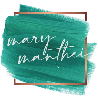

The Best Brands Don’t Have to Start in a Boardroom
When I first started building the brand for Ask For Nina, I knew I wanted it to feel personal. Real estate is personal. It’s emotional. It’s tied to some of the biggest moments in people’s lives.
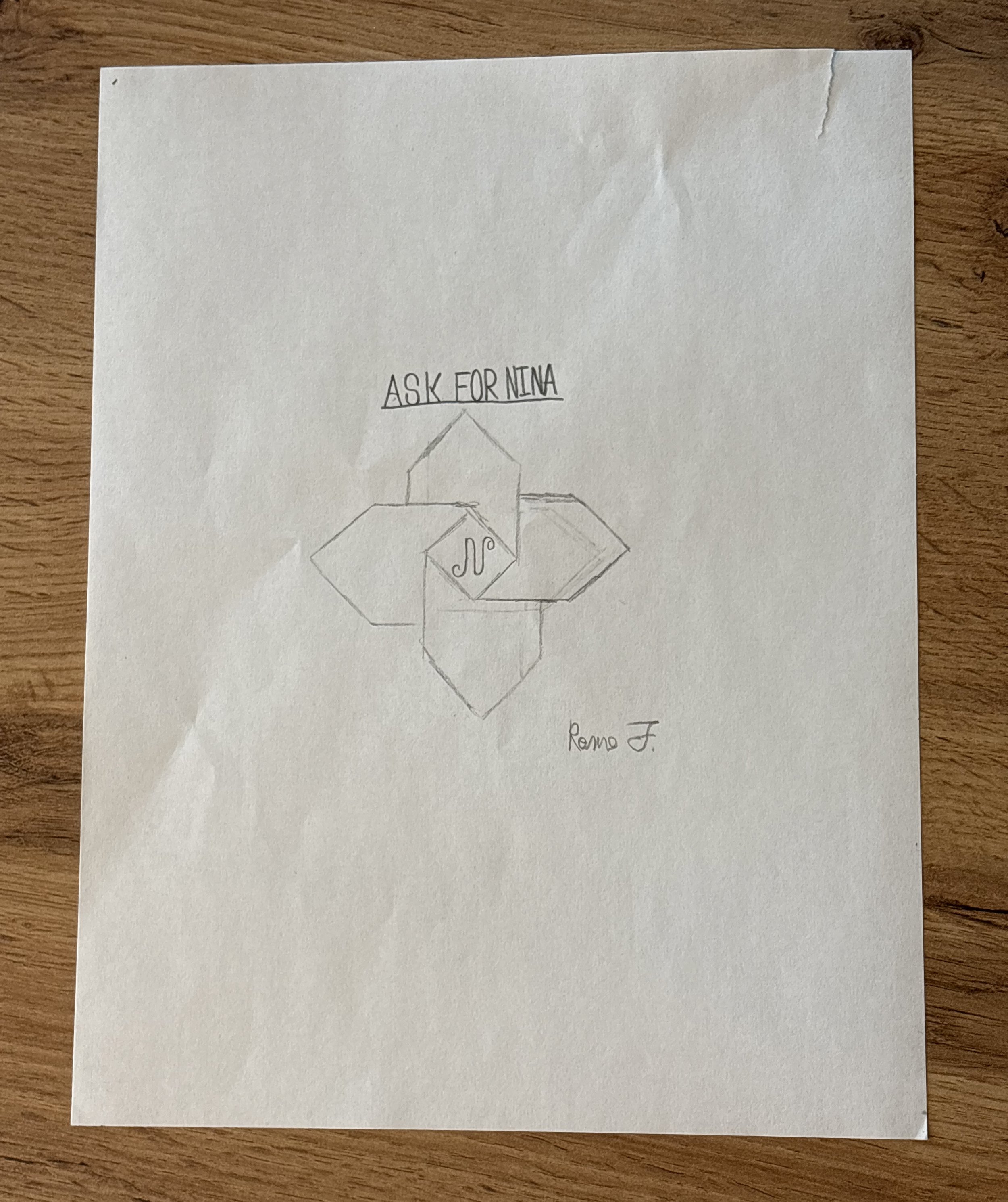
What I didn’t expect was that one of the most meaningful contributions to the brand would come from Nina’s son, Rome Ferraro.
Rome created his own version of the logo after years of quietly listening to his mom work. Not from a marketing meeting. Not from a design brief. Just from observing who she is and how she shows up for people every day.
And honestly? His reasoning behind it says more about Nina than any polished branding presentation ever could.
He wrote:
“So basically… I’ve been hearing about houses my whole life.
Not even kidding. My mom is always on the phone—talking about offers, closings, inspections… stuff I didn’t really care about at first. It just sounded like a different language.But after a while, I started picking things up.
Like how every house she talks about isn’t just a house. It’s someone’s first place. Or someone moving on. Or someone starting over.
It’s kinda like… every house has its own story.One day I was just sitting there while she was working (again 😄), and I started thinking—if she’s helping all these different people with all these different houses… why is there only one house in a logo?
So I grabbed a pencil and started sketching.
I drew one house… then another… then two more.
Four houses all together.Because it felt more like what she actually does—not just one home, but a bunch of them. Different people, different stories, all connected in a way.
I showed her, and I don’t think she expected it.
But yeah… that’s kinda how the logo happened.
Just from listening all these years.”
There’s something incredibly special about that perspective.
Kids notice more than we think they do. They see consistency. They see passion. They see how their parents treat people when no one is watching. And in Rome’s case, he turned those observations into something creative and thoughtful.
What I love most is that his version of the logo wasn’t really about houses at all. It was about people. About stories. About connection.
That’s the heart of a strong brand.
Not perfection.
Not trends.
Not trying to sound bigger than you are.
Just authenticity people can feel.
Working on this project reminded me that branding is at its best when it reflects the truth of someone’s character. And sometimes the people who know us best can articulate that more clearly than we can ourselves.
Rome’s sketch captured the spirit behind the brand in a way that felt honest, warm, and deeply human — which, if you ask me, is exactly what real estate should feel like.
I’m really proud to have played a part in bringing Ask For Nina’s brand to life, and even more proud that this small piece of the story belongs to Rome.